Lakeside byDream Companies
- UX & UI Redesign
- Luxury Real Estate
- Design System
- AI Photography

Before — Current Site
After — Gabriel's Redesign
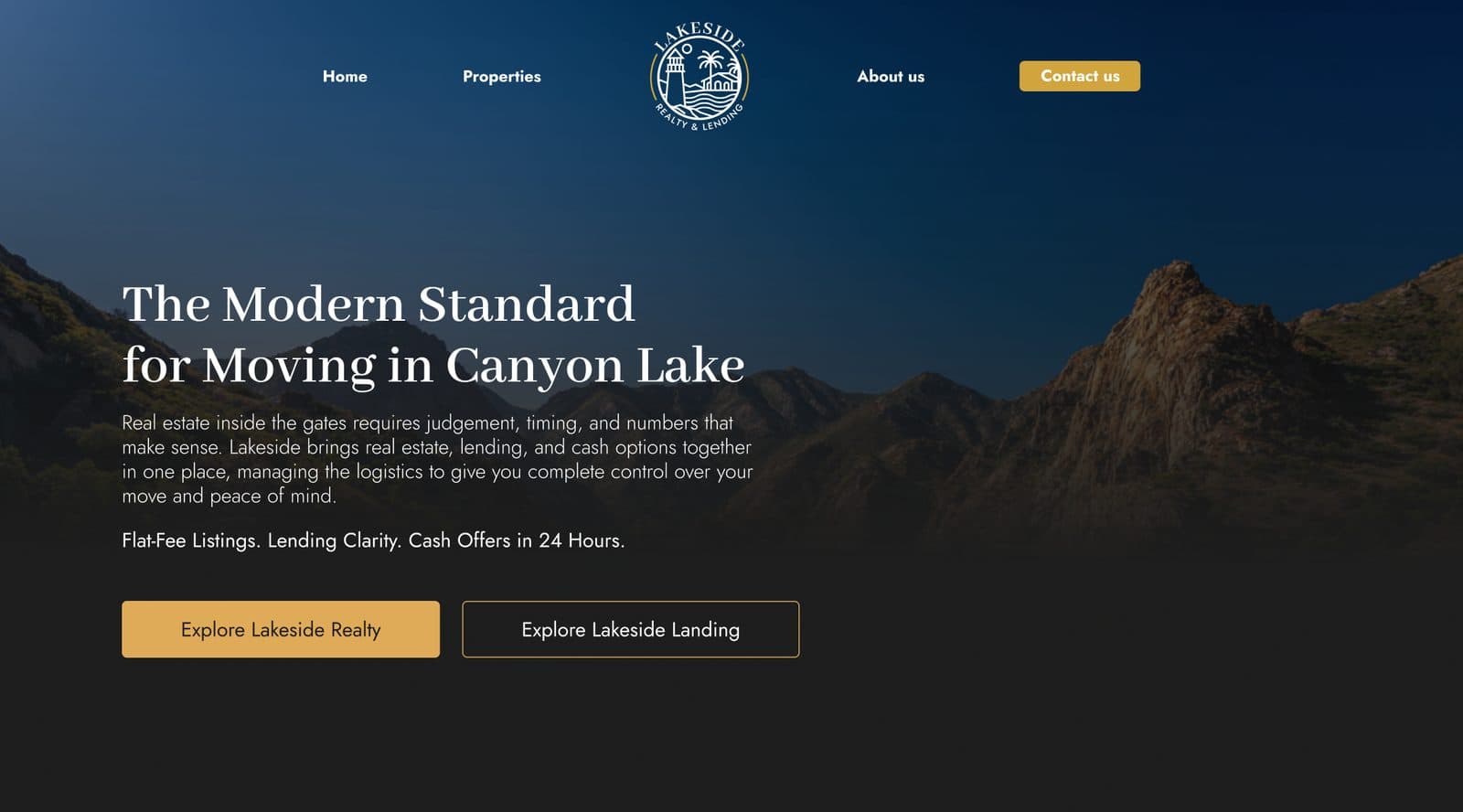
Drag to compare
A luxury lakeside propertythat deserved a digitalexperience to match.
Lakeside by Dream Companies is a premium real estate development that positions itself firmly in the luxury segment. Every aspect of the property speaks to exclusivity, refinement, and aspirational living. The problem was simple: the digital presence did not.
The goal was to redesign the Lakeside web experience from the ground up, creating a UI that communicated the same sense of luxury and calm sophistication that a potential buyer would feel walking through the property itself. A site where the first impression sells.
Understanding the brandbefore opening Figma.
Luxury real estate is one of the most emotionally-driven purchase decisions a person makes. The analysis began not with wireframes, but with understanding who Lakeside's buyer is, what they value, and what feelings the digital experience needed to evoke before a single word is read.
The brand audit identified a clear gap: the existing presence used a generic real estate template that felt interchangeable with thousands of other listings. Lakeside is not a listing. It is a lifestyle. The redesign needed to communicate that distance immediately.
Every pixel earnsits place.
Luxury design is defined by what is removed, not what is added. The redesign stripped away anything that distracted from the property itself: heavy navigation, excessive copy, template-driven layout patterns. What remained was space, intention, and the property's natural beauty.
Cormorant Garamond was chosen as the primary display typeface. A refined editorial serif with deep roots in print luxury, it carries the weight of heritage and restraint that the brand needed. It contrasted against clean geometric sans-serif body text to create a hierarchy that feels both premium and legible.
“Luxury is not about the price tag. It is about the feeling. The website needed to make someone feel they had already arrived.”
Design principle, Lakeside Redesign
Deep night, aged gold.
Deep Night
#0D0F0E
Primary Background
Aged Gold
#B8965A
Luxury Accent
Warm Linen
#EDE5D8
Typography / Light
Forest Deep
#2C3B34
Supporting Dark
Warm Stone
#9A9082
Body Text
Arrivebefore youarrive
Cormorant Garamond · Display · Google Fonts
Cormorant Garamond
A refined editorial serif with deep roots in print luxury. It carries heritage and restraint, contrasted against clean geometric sans-serif body text for a hierarchy that reads premium and stays legible.
From buyer personato high-fidelity UI.
Five stages, each one narrowing the gap between what the property is and what the website said it was.
- 01
Buyer Persona Mapping
Profiled the primary buyer segment: high-net-worth individuals who have purchased luxury property before and expect the digital experience to reflect the product quality.
- 02
Competitive Landscape
Benchmarked against leading luxury real estate brands globally. Identified the visual codes of luxury: negative space, editorial typography, restrained colour, and cinematic imagery.
- 03
Style Guide in Figma
Created a comprehensive design system in Figma: colour tokens, type scales, spacing grid, component library, and brand guidelines to ensure consistency across every screen.
- 04
High-Fidelity UI Design
Designed the full homepage and landing page in Figma with scroll animations, property gallery interactions, and immersive hero sections that let the property speak for itself.
- 05
AI-Generated Photography
The client had limited property photos. To solve this, I generated cinematic lifestyle and architectural imagery using Midjourney and Gemini, producing assets that matched the luxury aesthetic without requiring a full photo shoot.
Every screen. Everydetail. Figma-native.
The full homepage was designed as a single immersive experience: from the editorial hero through property listings, lending services, and the closing narrative. Each section uses negative space, gold accents, and Cormorant Garamond serif type to maintain the luxury register throughout.
A digital presenceas exclusive as theproperty itself.
The redesign transformed Lakeside from a generic real estate listing into a bespoke digital experience that communicates exclusivity from the first frame. Prospective buyers now encounter a visual narrative that mirrors the quality of the property they are considering.
When a luxury product is presented with a luxury experience, trust is built before a single conversation happens. The new Lakeside site creates that trust instantly, reducing friction in the lead qualification process and elevating the perceived value of the development.
- 100%
- Custom Design System
- 2x
- Pages Redesigned
- ↑
- Perceived Brand Value
- 0px
- Generic Templates Used
Designed in Figma.Built for luxury.
- FigmaUI & Style Guide
- MidjourneyAI Photography
- GeminiAI Imagery & Research
- PhotoshopImage Retouching
- IllustratorBrand Assets
- ClaudeCopy & Strategy
Your brand deservesa digital presencebuilt for its level.
I design experiences that convert, because they feel exactly right for the people they are built for.
Let's Talk